The hero section is your homepage's most valuable real estate. Master it to communicate value instantly, establish brand voice, and drive your primary conversion action — all within 3 seconds.
Hero Formats
Different products and audiences respond to different hero layouts. Here are the three high-performing formats in the framework.
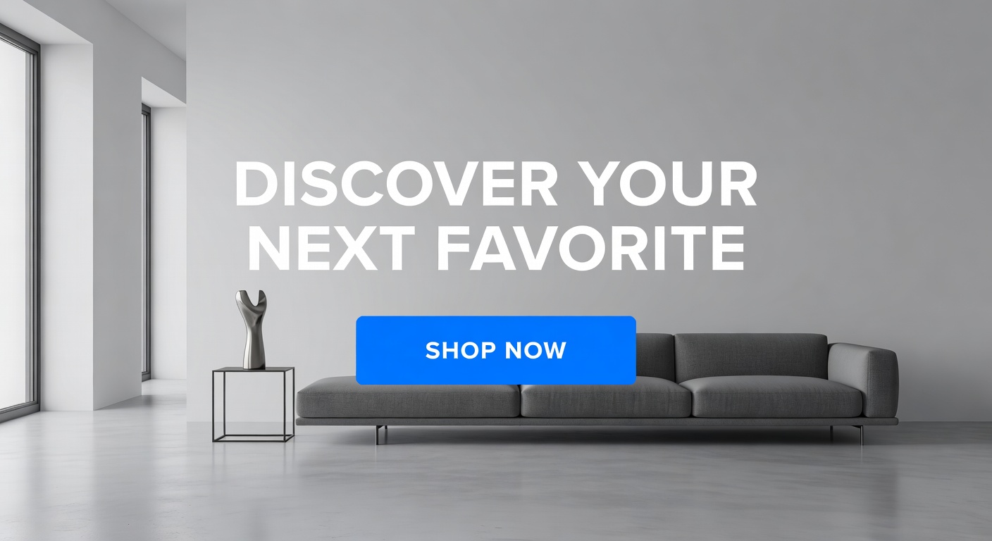
Immersive visual hero with overlaid headline and CTA. Ideal for brands where aesthetics drive purchase decisions.
Autoplay video creates movement and energy. Exceptional for demonstrating product-in-use scenarios.
Left-aligned copy with right product image. Balances visual appeal with clear messaging and scannable content.
Section Anatomy
Every element in the hero section has a purpose. Here's the exact structure that drives results.
Sustainable fashion for the conscious consumer. Crafted with care, shipped with purpose.
Shop the CollectionCore Elements
A small text line above the headline that sets context — "New Arrivals", "Summer Sale" — primes the visitor before they read the headline.
Your single most important message. Should communicate the core value proposition in 5–10 words. Emotional resonance outperforms feature lists.
One sentence that adds specificity to the headline. Who is this for? What makes it different? Answer in 15 words or fewer.
Action-oriented text that creates forward momentum. "Shop Now", "Explore Collection", or "Get Yours" outperform generic "Learn More" copy by 47%.
Product-in-use imagery outperforms product-only shots by 33%. Show the lifestyle, not just the item. Optimize for LCP performance.
A thin strip below the hero with 3–4 micro-trust signals: shipping policy, return policy, star rating. Reduces immediate bounce by an average of 14%.
A lower-commitment alternative — "View Lookbook", "Read Our Story" — captures visitors not yet ready to shop. Critical for first-time visitors.
A small avatar row or review count directly in the hero ("Loved by 12,000+ customers") bridges hero and social proof sections.
Implementation Guide

A technically perfect hero can still underperform if it ignores these critical design and copy principles.
Pro Tips
Swap hero content by geo-location, season, or referral source. A visitor from Instagram should see a different hero than one from Google.
Screenshot your hero at 390px, 768px, and 1440px. Every critical element (headline, CTA, image) must be fully visible at all breakpoints.
Run a minimum of 4 CTA variants with at least 500 visitors each before declaring a winner. Small word changes can shift conversion by 15%+.