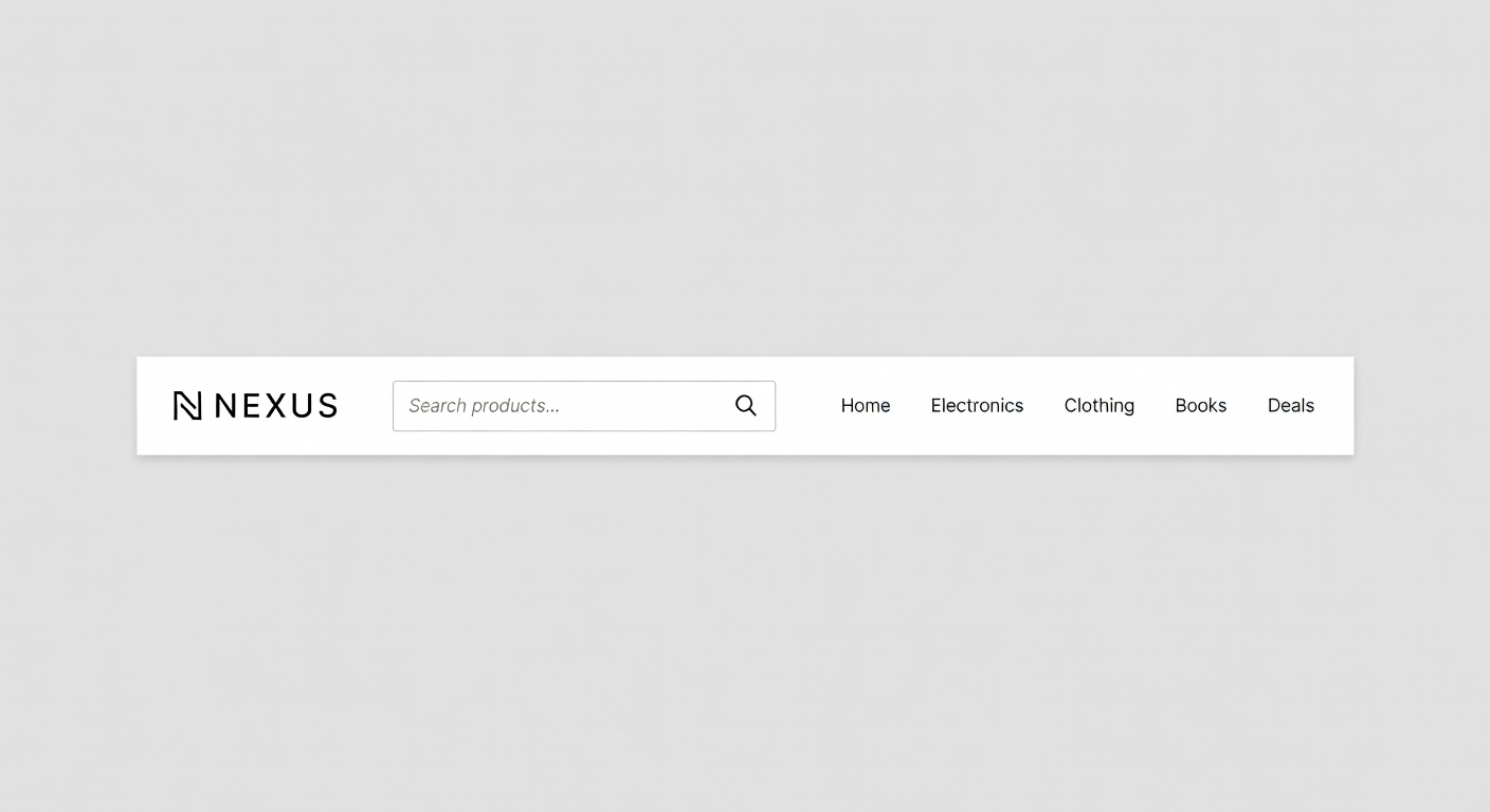
Navigation Flow Design Module
Build navigation that thinks like your customer. Learn how information architecture, visual hierarchy, and interaction design work together to create effortless shopping journeys that drive revenue.
Build navigation that thinks like your customer. Learn how information architecture, visual hierarchy, and interaction design work together to create effortless shopping journeys that drive revenue.
Different stores need different navigation paradigms. Understanding when to use each pattern — and how to implement it correctly — is the foundation of a high-performing storefront.
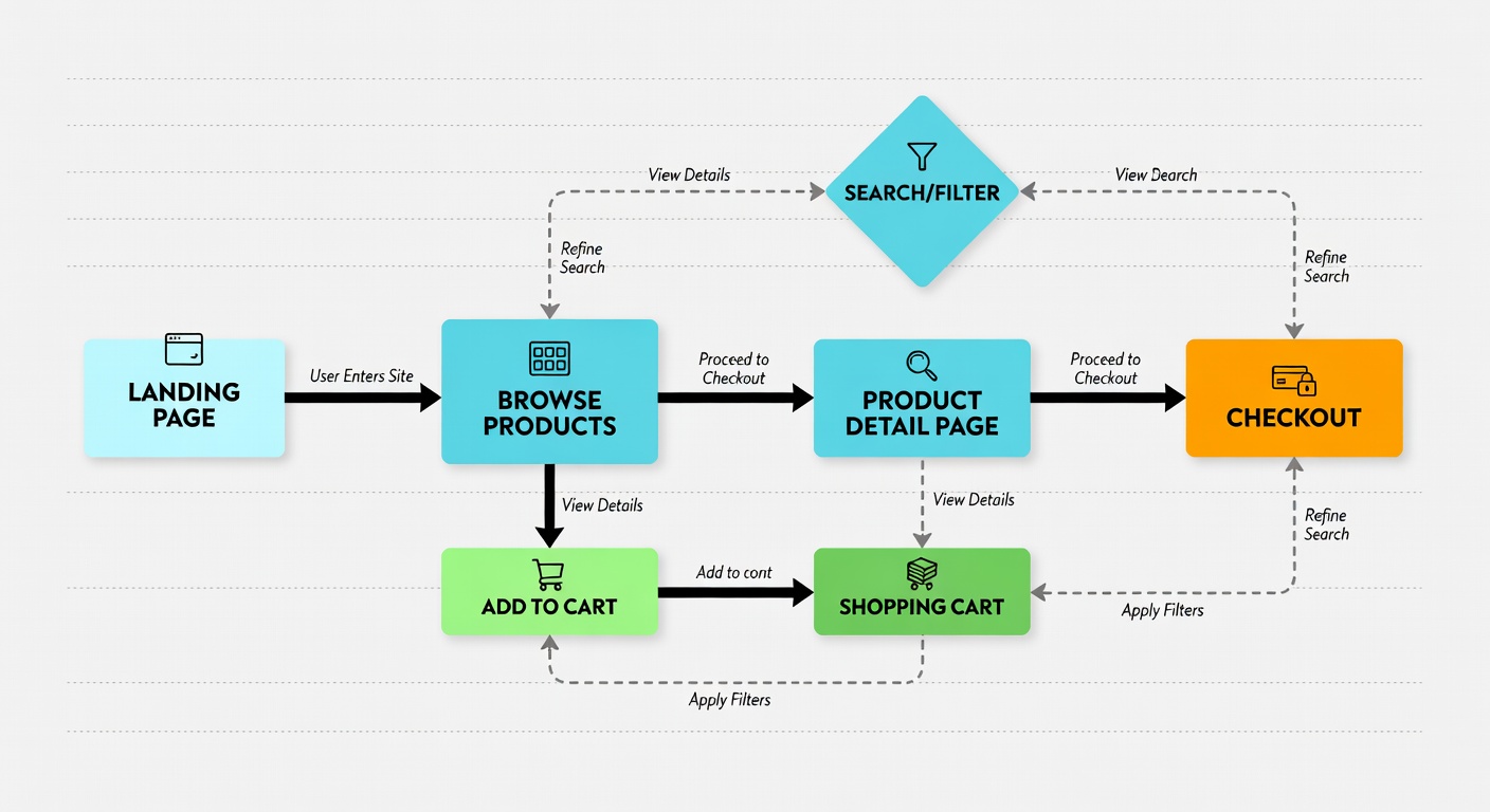
Every product in your store should be reachable within three clicks from the homepage. This isn't just UX folklore — it's a measurable design constraint that forces you to build logical, shallow navigation hierarchies that respect your customer's time and patience.
Customer arrives via homepage, ad, or search result
Browse to the relevant category or subcategory page
Land on the specific product detail page, ready to purchase
Choosing between a mega menu and a traditional dropdown is one of the most impactful navigation decisions you'll make. Here's a clear-eyed comparison to guide your choice.
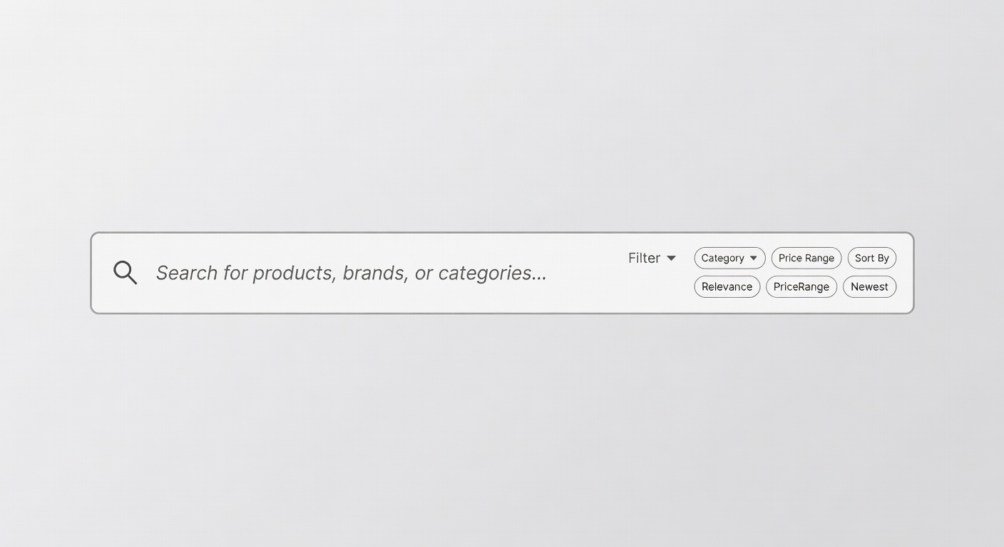
Visitors who use site search convert at 5–6x the rate of those who don't. Yet most stores treat search as an afterthought. Make it your most powerful navigation tool.
Show product names, categories, and brands as the user types. Include product thumbnails for faster recognition.
Never show an empty results page. Suggest similar products, popular categories, or connect to live support.
Display trending and seasonal search terms on focus to guide discovery and reduce search effort.
Map common misspellings and synonyms so customers always find what they're looking for regardless of exact phrasing.
Master these four principles and your navigation will guide customers naturally from discovery to purchase without friction or confusion.
Prefer breadth over depth in your category structure. A flat hierarchy with more top-level categories is almost always easier to navigate than a deep hierarchy requiring multiple levels of drilling. Aim for no more than three levels: top-level category, subcategory, product.
Label your navigation using the words your customers use when searching for products — not your internal SKU taxonomy or warehouse organisation system. Conduct user research, analyse search queries, and test navigation labels with real users before committing to a structure.
Use typography weight, size, colour, and spacing to communicate the relative importance of navigation items. Primary categories should be immediately scannable. Use the active state and hover states to confirm user location and provide clear affordances for interaction.
Maintain clear wayfinding across the entire shopping journey. Breadcrumbs, active nav states, and category headers should always tell the customer exactly where they are and how to get back. Disoriented shoppers abandon — give them persistent, visible context at every step.